It seems that more and more people do their online shopping through mobile platforms. That often begs the questions, “When I’m designing a site, should I make it mobile first?” People want to know if they should design their site mainly for mobile, with desktop as the secondary thought.
It’s definitely an interesting idea but will it prove successful in the end?
That’s the question we’ll try to answer and (spoiler) it really depends.
When to Choose Mobile or Desktop
It all depends on the market. If you’re selling health insurance then it might be better to start with desktop then move to mobile based on that design.
If you’re a retail store that sells 90’s memorabilia, then you might want to go with the mobile design first.
The demographic split between younger and older audiences plays a key role in the use of these devices. Younger people tend to use mobile more than the older generations.
The industry also plays a key role. People like to use desktop for important transactions like buying insurance. They want to know that chat and other options are available to them.
Shopping, on the other hand, could go either way. When you’re selling a product, it’s better to focus on the age demographic.
Based on this data, you want to start designing a new site with mobile in mind, then there are some simple tricks that you can use to get started.
To give you an example, Typeform is a company that helps you create questionnaires in the most basic and visually appealing way possible.
Take a look at the design for their mobile website.
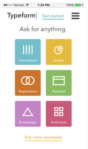
You have all the basics waiting to be clicked and all the information on their site is available at a single glance. This is one of the best ways to approach mobile website design. Keep in mind that mobile users want ease and instant success when they first navigate a site.
Frustrate them with an overly complex deign and they’ll leave immediately.
Now that you have a good design for your landing page, you should make navigation as smooth as possible. This typically entails combining subcategories into the most basic pages you can make. For example, Buzzfeed only has 6 tabs to navigate the thousands and thousands of pages they have.
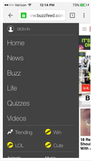
If you’re looking for a video, you just head to that page and navigate from there. It’s simple and that’s what works best for mobile users on the go.
Desktop Over Mobile
It might be best to stick with desktop when your audience is older and you cover a lot of information on your site. People using mobile are usually shopping or reading short articles. I’ll use the healthcare example again, if your page has a lot of information that’s important, people will generally want to read that on desktop before they make a major decision.
Here is a page for Healthcare.gov when you’re looking into different coverage plans.
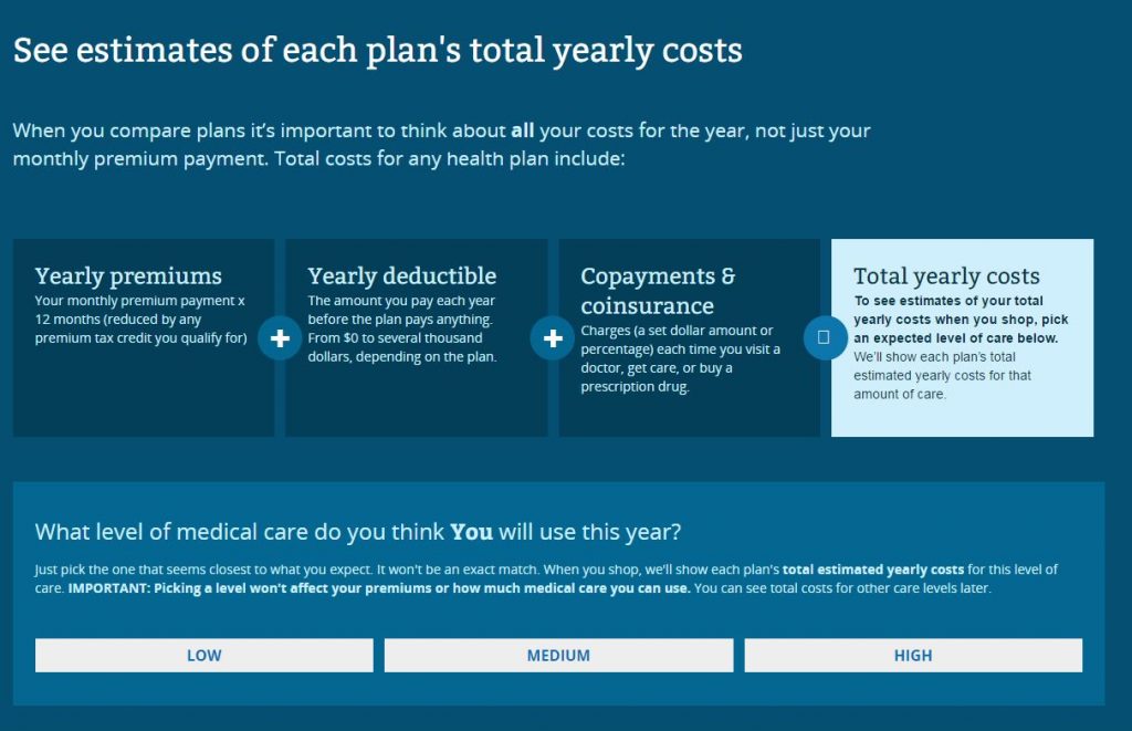
Obviously, you want to do additional research with other providers and read all the material they have as well. It’s easier to switch from one site to another, enter personal information, and save documents when using desktop. That’s why people will usually choose that option.
You get all this information on one page instead of scrolling endlessly for the next section on your mobile device.
Conclusion
When you’re designing a site, think about your audience and what they need. Next, consider what your site is about and which design would work better for your demographic. Just keep these items in mind and you should be able to make the right call for your next site design
Product or Service Type (Industry)
- Age Demographic
- Amount of Information
- Complexity of Information
- Structure of Navigation