The world is shifting to mobile-friendly website designs and you have to get with the times to keep your customer base. That’s why a Mobile/Desktop Audit is necessary. If you don’t know what I’m talking about, it simply means, you have two different versions of your website, or you should. You have one for mobile devices, like tablets and phones. Then you have your original desktop design. Now, the current mindset is to use a responsive design that conforms your desktop design to a mobile design.
If you’ve already done this, then you may want to perform a Mobile/Desktop Audit to make sure that everything on your mobile version looks great and has no errors.
How to Perform a Mobile/Desktop Audit
There are a few Google Chrome apps that we like to use to assess the situation; the first being “SEO META in 1-Click” and “Mobile Browser Emulator.”
Now, let’s look at the mobile version of a site that you’re familiar with and the desktop version of the same site to see if they’re adhering to the best practices. Let’s use Nintendo’s website as an example. This is their desktop version:
This is their desktop version:

Colorful, fun, and a perfect representation of the company itself, this site offers everything you need to check out their latest products.
We will ignore their terrible SEO headers for this article, but our team would start by checking the page and seeing if it offers the same functionality on mobile. This is where the emulator plugin comes into play. Go ahead and open that on the page you want to check.
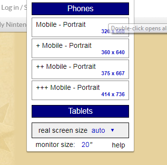
We will choose the mobile portrait view, which is just a basic phone.
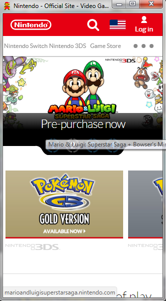
Right away, we lose quite some things. The first thing you may have noticed to go is the menu. It’s been replaced by the three dots that indicate a collapsible menu. This is fine, but Nintendo’s icon doesn’t stand out, which might be confusing for users.
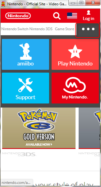
Next, their menu items for mobile are different than those for desktop. These should remain the same, but it looks like Nintendo has dropped their categories for Switch, 3DS, and the Store.
Next on the list is the slider that displays their latest and greatest games. The one on desktop is great, their mobile, however, seems to break. You can see a little bit of Pokémon Gold and Silver gets cut off.
The idea is to make your mobile look as good or better than your desktop. In this way, you should go through all your pages and compare everything with your desktop version. Make sure users can get the same experience from the mobile as they do from desktop. That means every link on desktop should be available on mobile too.
Mobile SEO Audit
Now, let’s use the SEO tool to do some diagnostics. By this point, you should have gone to the website and checked for any aesthetic inconsistencies. This would include images not appearing, missing menu items, different links, etc.
When all of this is good to go, then you can move on to checking the SEO. Depending on the theme you choose, your mobile SEO might appear differently than it does on desktop. Remember to check both.
The SEO tool checks for some common things on your page.
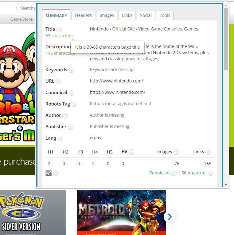
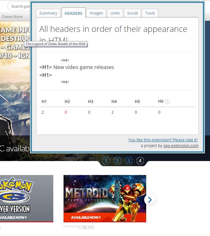
As you can see, Nintendo’s title and meta description are pretty good, but their headers are just terrible. As stated above, we’re going to ignore this. You just want to make sure when you SEO your site that your mobile version displays the same quality SEO as your desktop. That means all the headers are the same, the meta description is the same, etc.
Note: this should not be a problem, as most themes just copy this information over to the mobile version.
What you really need to pay attention to is the “Responsive Design.” This is the most crucial factor. Remember Nintendo’s slider for their games. That’s an example of a non-responsive design. Instead of shifting the elements down or only displaying 1 image at a time for their slider, it tries to keep the same formatting, which does not work.
Just as you did with the content of your website, go through and make sure your other pages are responsive as well.
Mobile/Desktop Audit: Speed
Now, your mobile site should load faster than your desktop version. Test both and make sure you have a fast mobile setup. Why this matters more on mobile is because of your audiences. Mobile users want immediacy and if that’s not given, they will jump ship and find someone else that can deliver.
Mobile/Desktop Audit: Conclusion
It pays to go through these tedious tasks to make sure your website is mobile-friendly. More and more people are using their phone as their sole internet browsing machine. If you don’t have a mobile site that can keep up with the times, you might be dead in the water.