Gutenberg might be the most exciting thing to hit WordPress since third party applications/plugins. I’m going to come right out and say this is a smart move for a company that realized its way-way behind the times on drag and drop CMS platforms. WordPress has been getting killed by newer platforms like Squarespace and Wix that make website creation easy and simple #NOTANAD. That’s why (we think) WordPress is being pressured to follow the wave and move their platform in a more user-friendly direction.
What is Gutenberg?
Gutenberg is an upcoming update that will shift WordPress’s platform from the HTML or basic text editor to a CMS drag and drop editor like that found on the previously mentioned sites above. Where once there was code and frustration, now there are convenient blocks to make your website just the way you want it . . . kind of.
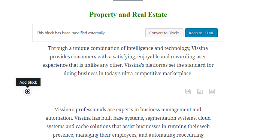
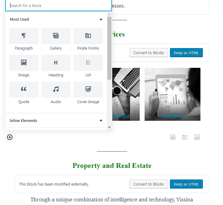
This is going to be more of a review than an informational piece. I’ve personally played around with the free Gutenberg app WordPress is letting people use before they push Gutenberg as their main editor. Here’s the basic layout for a page:
Right now, you don’t get a lot of variety with the tools they give you. You have a one block structure right now. You can create a new block above or below the previous block, stacking up a tower that gives you a page, simple.
The set comes with some pretty basic blocks to use, (text, a gallery, contact form, single image, header, and not much else). My immediate impression is disappointment from such a large platform like WordPress. You’d think their first glimpse into such a drastic shift would be immaculate. Right now, it seems like they’re crowd-sourcing ideas with this plugin. You can test it out and offer some feedback through their forum.
It shocking to me that they didn’t just take the best features of other platforms like Squarespace. Speaking of the competition, let’s take a look at another platform to give you some context.
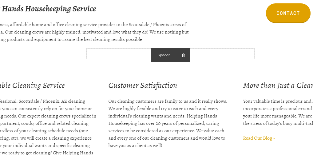
First, let me start by saying the inability to stack multiple columns in Gutenberg immediately kills the functionality. Take a look at the example above. I can create a row (just like in Gutenberg) and put anything I want into different columns within that row (unlike Gutenberg). That’s how I achieved the button/text combo on the first row and the three text columns on the row below it. Gutenberg allows two columns, max. It’s pretty limited. It even breaks from time to time if you put anything too complex in your columns, like images and videos.
WordPress Gutenberg Navigation and Styling
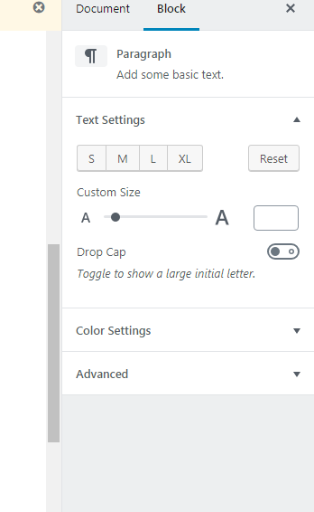
The navigation is nice when you’re working in the blocks. Let’s say you’re writing a lengthy piece of text and you want to change the color or size of your text. Gutenberg lets you do that. Off to the right of your main screen, you’ll see a simple panel that serves as your control center.
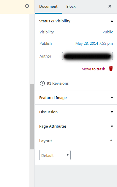
When you’re not working in a block, you see a menu similar to the older version of WordPress editor.
It’s nice being able to change certain things (like the layout) all in one place – but that’s really the only convenient thing about Gutenberg. The fact that I have to press an up or down button to move a block is just . . . I don’t even know, terrible, in a word.
Conclusion of WordPress Gutenberg?
For the moment, Gutenberg is bare bones “drag and drop” and needs a lot of work before it can compete with the top dogs. I, personally give Gutenberg a solid 5 out of 10 for now. I know that they are a platform that grows and evolves slowly over time with the help of the community. They might even become better than Wix and Squarespace in the future, who knows? But for now, I’m unimpressed. If you’re looking to build a site on Gutenberg or revamp your current site, I would wait a little longer – at least until they officially launch the platform and it’s not just a plugin/testing community.

